


From
Legacy to Modernization
Legacy to Modernization
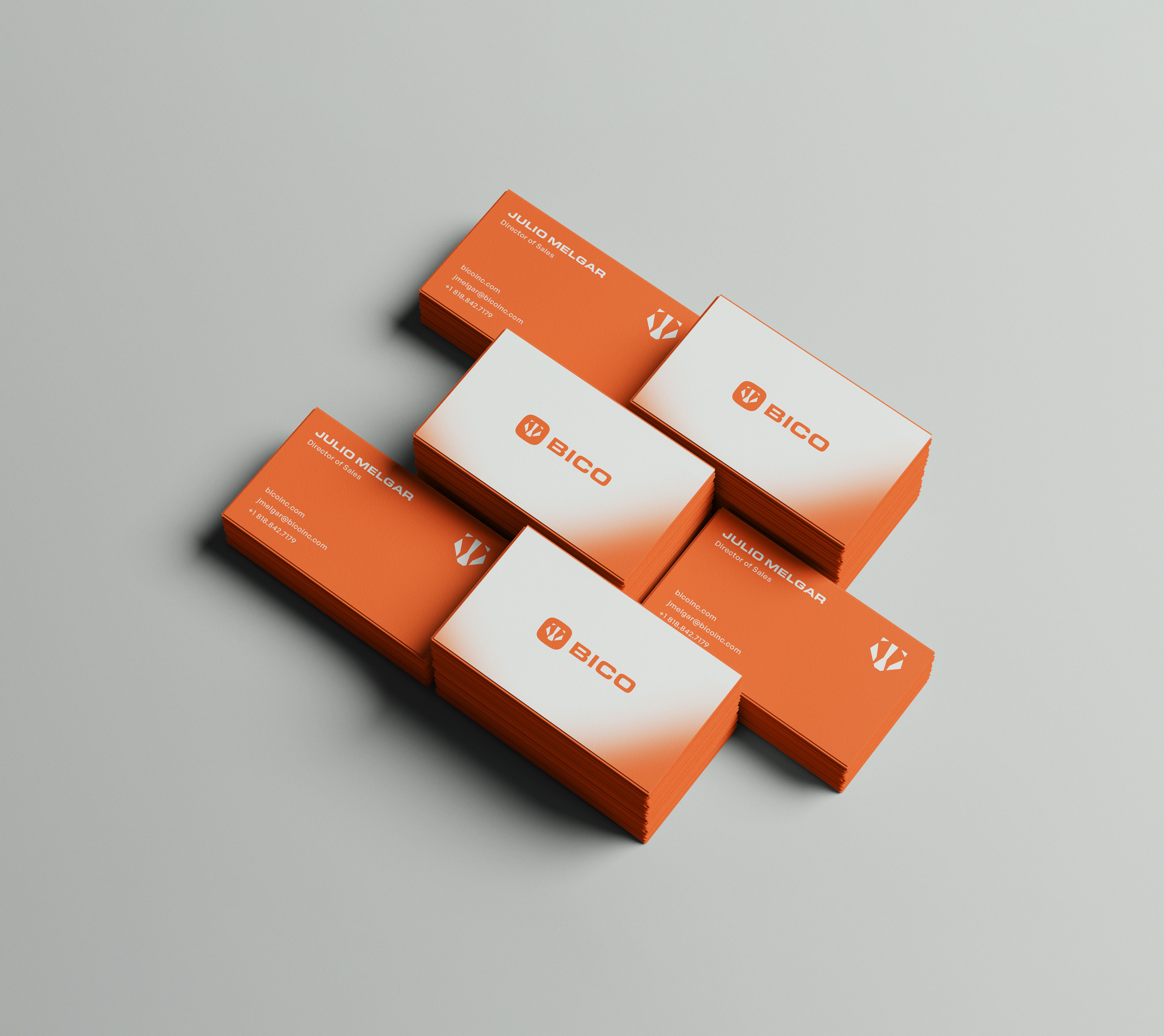
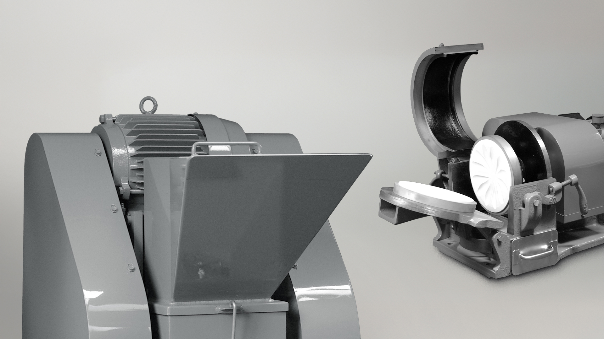
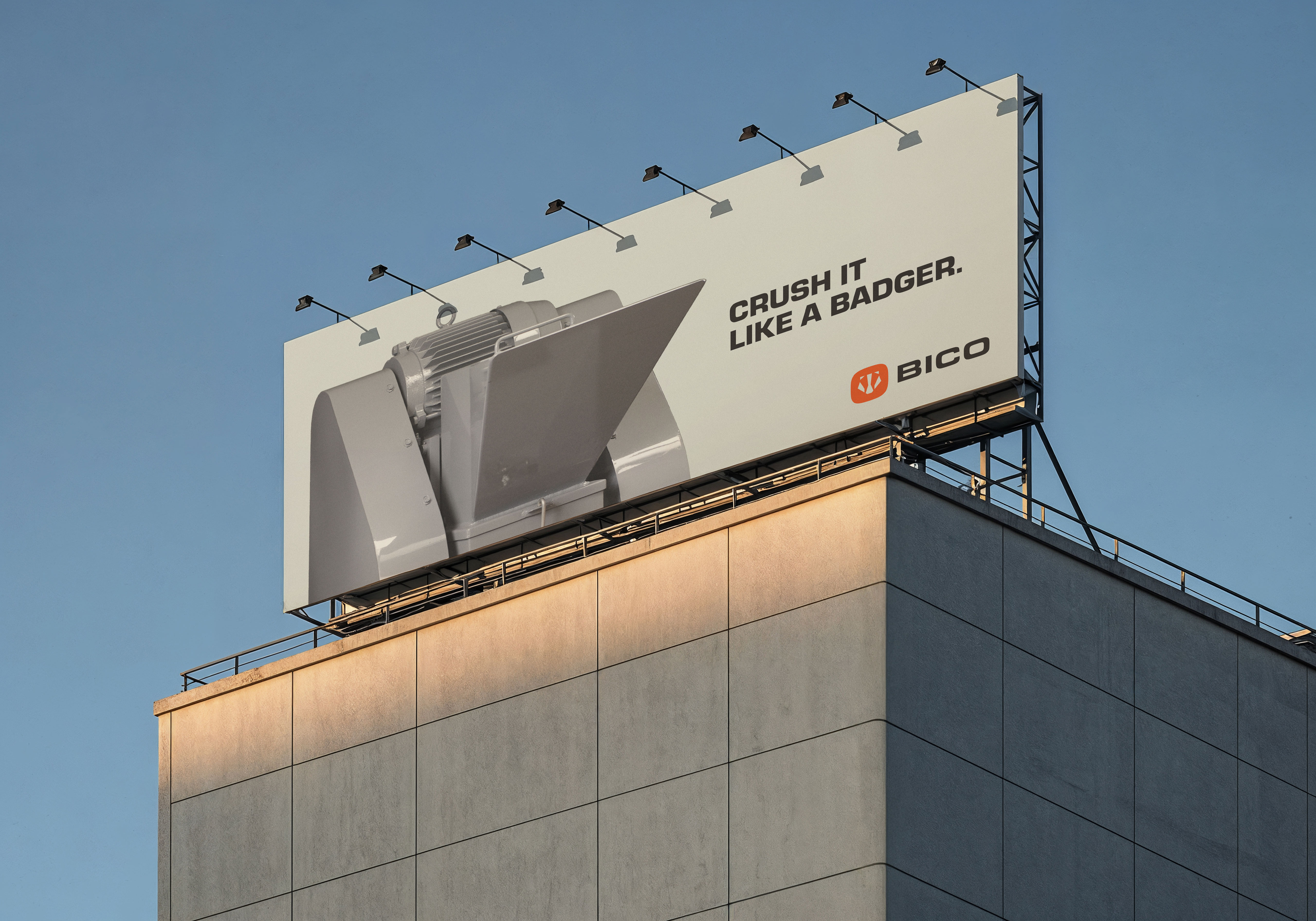
BICO’s previous identity served the brand well for decades—sturdy, no-frills, and practical, just like its products. But as the company’s global reach expanded and new generations of engineers and scientists began engaging with the brand, it became clear that the visual language needed to evolve. The transformation wasn’t about reinventing BICO—it was about revealing its strength in a more intentional and strategic way. The new brand retains the essence of the original—reliability, quality, and heritage—while sharpening its visual impact through updated typography, a simplified logo, and a color palette inspired by American industry. The result is a modern identity that speaks clearly to BICO’s mission: to be the most respected and cost-effective brand in the world, built local, trusted global.